Graphical excellence is that which gives to the viewer the greatest number of ideas in the shortest time with the least ink in the smallest space. - Edward Tufte, 2001
18.1 Chapter Overview
The evolved brain and pattern recognition, a general guide for creating and iterating on visualizations, and principles for creating good visualizations while avoiding common mistakes.
18.2 Introduction
The human visual system is astonishingly good at detecting structure. We can spot a trend, an outlier, or a cluster in a scatter plot almost instantly — the kind of pattern recognition that would take minutes of staring at a table of numbers, if we noticed it at all. Good visualization leverages this hardware. It turns data into something your eyes can reason about directly.
Consider the following example of tabular data, with four sets of paired \(x\) and \(y\) coordinates.
Something not obvious by looking at the tabular data above is that each set of data has the same summary statistics. That is, the four sets of data are all described by the same linear features.
Analytical summarization alone is not enough to understand the data. We need to visualize the data to see the patterns emerge, wherein each of the four datasets tells a very different story:
This is Anscombe’s Quartet, a famous demonstration that summary statistics can hide wildly different data-generating processes. Four datasets with identical means, slopes, correlations — and completely different stories once you actually look at them. The lesson generalizes: Table 18.1 summarizes some of the reasons visualization belongs in every modeler’s workflow.
Table 18.1: A list of reasons to practice the art and science of data visualization.
Purpose
Description
Simplify Complexity
Raw data can be overwhelming, especially with large datasets or many variables. A single visualization can condense thousands of data points into a clear picture.
Reveal Patterns and Relationships
Some insights are hidden in plain sight until you visualize them, such as the relationships in Anscombe’s Quartet example.
Support Better Decisions
Understanding patterns and relationships can then translate into better decision making, such as highlighting trends or risks at a glance.
Communicate Effectively
Conveying information to others in a visual manner is one of the most effective ways of aiding understanding. The best visualizations don’t just inform — they tell a story that’s useful for understanding and decision making.
Encourage Exploration
Visual exploration is at the heart of understanding data, uncovering distributions, relationships, or unusual patterns before diving into formal models.
If you find yourself explaining a table to someone — “see, the third column is growing faster than the second” — that’s a sign a chart would do the job better.
18.3 Developing Visualizations
With the why established, let’s turn to the how. The principles below aren’t comprehensive — entire careers are built around information design — but they cover the mistakes we see most often in practice.
18.3.1 Define Your Message
Before you write any plotting code, ask: what am I trying to show? A visualization that tries to show everything usually shows nothing. If you’re comparing portfolio returns across strategies, that’s a different chart than if you’re illustrating the distribution of a single strategy’s returns. The clearer you are about the one thing the reader should take away, the easier every subsequent design decision becomes.
It also helps to know your audience. A board presentation calls for a different level of detail than an internal model review — not because one audience is smarter, but because their questions are different.
18.3.2 Emphasize Accuracy and Integrity
The most common sin in data visualization is distortion. Truncated axes make small differences look dramatic. Non-uniform scales hide trends or manufacture them. If you’re plotting growth or quantities that span orders of magnitude, a logarithmic axis is often more honest than a linear one.
Human perception introduces its own distortions. We are poor at comparing arc lengths, which is why pie charts are almost always inferior to a simple bar chart. Area is even trickier: it scales as the square of the radius, so a circle that looks four times as large may only represent twice the value. These perceptual traps are well-documented, and yet they appear constantly in professional reports. Every visual element should serve the data, not decorate it.
18.3.3 Prioritize Clarity Over Complexity
Tufte coined the term “chartjunk” for decorative elements that add no information — gratuitous gridlines, rainbow color palettes, 3D effects on 2D data. These aren’t just aesthetic complaints; they actively interfere with reading the data. A clean chart with precise labels and a legible font does more work than an elaborate one. When in doubt, remove an element and see if anything is lost. Usually it isn’t.
18.3.4 Organize Data Thoughtfully
When the data has many variables or a long time axis, resist the urge to cram everything into one plot. Small multiples — the same chart repeated across subsets of the data — are one of the most powerful tools in visualization. They let the viewer make comparisons without overloading any single panel. If you do layer multiple datasets onto one plot, make sure each layer is visually distinct. A chart where you can’t tell which line is which has failed at its job.
18.3.5 Enhance Readability
Label your axes. It sounds obvious, but unlabeled or ambiguously labeled axes are among the most common problems in practice. Annotate directly on the plot where possible — the reader shouldn’t have to cross-reference a distant legend to understand what they’re looking at. Keep your color scheme consistent across related charts: if blue means “portfolio A” in one figure, it should mean the same thing in the next.
18.3.6 Validate and Iterate
Show your visualization to someone who wasn’t involved in making it. If they misread it, that’s useful information — the chart is communicating something different from what you intended. Visualization is an iterative process, much like writing: the first draft is rarely the final one.
Tip
Most financial modelers are familiar with putting together plots in Excel — quick charts, ad-hoc smoothing, and a few formatted tables to paste into presentations. In Julia you get all of that and reproducibility, parameterization, and automation. Instead of manual clicks, a short script can produce consistent charts for every scenario, embed them in reports, save high-resolution files, and be re-run whenever inputs change.
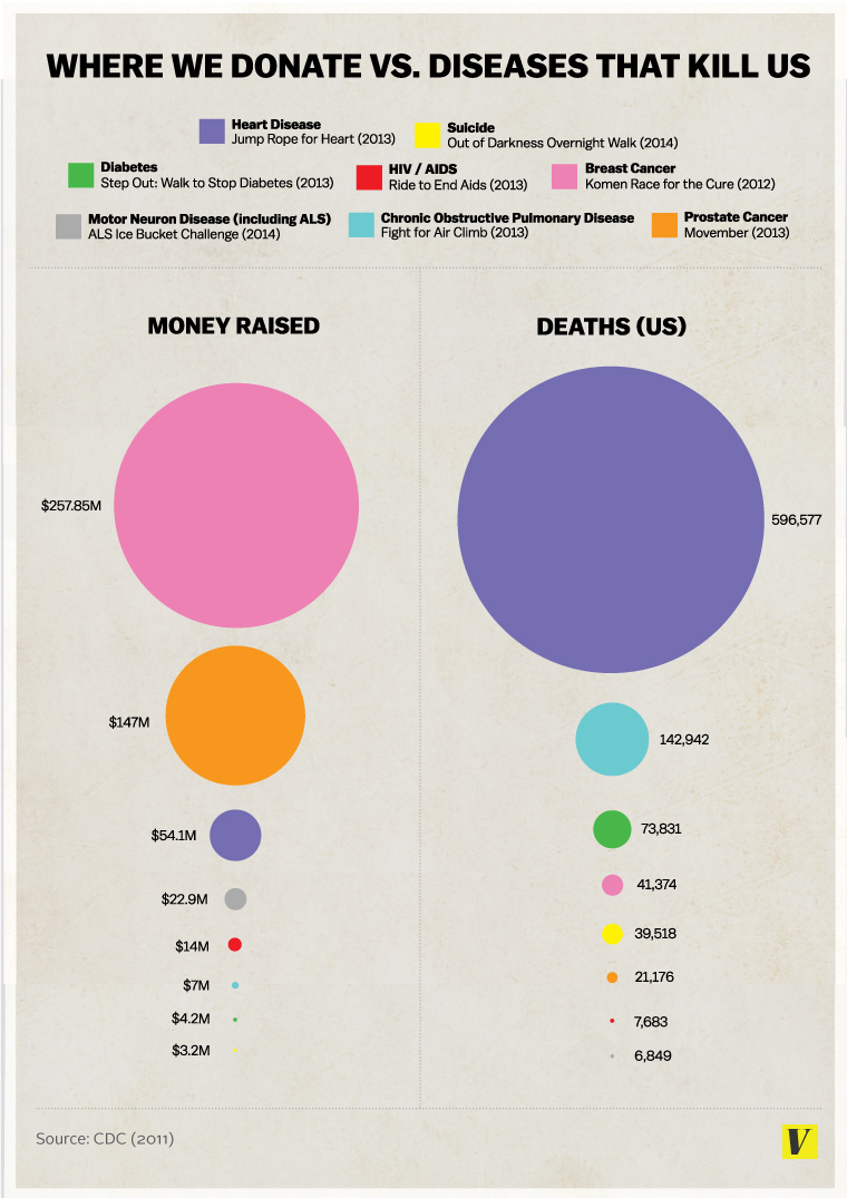
18.3.7 Example: Improving a Disease Funding Visualization
Let’s take a visualization (Figure 18.1) with several issues and apply the principles above to improve it.
This example was found via (Schwarz 2016), which identifies several issues with the graphic. The data is fundamentally two-dimensional (deaths and funding), yet it is presented with four degrees of visual variation: color, vertical ranking, horizontal categorization, and bubble size. That’s twice as many visual channels as data dimensions, which means the chart is working against itself.
The circles compound the problem. People intuit comparisons of area, not diameter — so the breast cancer funding circle appears nearly four times as large as the prostate cancer one, even though it represents less than twice the money. Disease names should be placed directly on the circles rather than in a separate legend, both for readability and for accessibility (color-blind readers can’t rely on hue alone). The numerical labels carry eight digits of precision for dollar amounts, which is noise, not signal. And one label is missing entirely.
Figure 18.1: Vox Media Infographic that inappropriately and ineffectively conveys data. From Vox Media (Accessed via Archive.org) (Matthews 2014).
In this revised version, we take the data as accurate and simply recast the visualization. We use a simpler 2D scatterplot mirroring the two-dimensional data, eliminate unnecessary color, and let the labels sit directly within the plot so the eye doesn’t need to jump between a legend and the datapoints. We also remove decimal-level precision in the axis ticks (unnecessary to tell the story) and strip out unnecessary plot elements like gridlines and axes without tick labels.
From the revised plot, two things jump out immediately: the cancers receive outsized funding relative to the deaths they cause, and heart disease is an outsized killer relative to everything else on the chart. Neither insight was obvious from the original graphic.
Better still, the clarity of the new chart raises questions the original never could. Is there an inverse relationship between perceived “control” over a disease and how much funding people direct to it? Does funding even correlate with research progress — has money accelerated cancer survival more than it has for heart disease? A good visualization doesn’t just answer the question you started with; it suggests the next question to ask.
18.4 Principles of Good Visualization
The practical advice above is about process. What follows are the underlying principles — most drawn from Tufte’s The Visual Display of Quantitative Information(Tufte 2001) — that explain why the process works.
First and foremost, represent the data without distortions of size or space. Refrain from clipping axes and do not rely on features such as shape area unless you have fully considered how viewers perceive them.
Use variations of visual features — color, marker style, line weight — to represent data dimensionality with purpose. If colors vary in a plot, they should carry meaning. Rather than jumping to a 3D plot, use variations in marker or line styles, or small multiples, to convey higher dimensions.
Good visualizations encourage the eye to compare different pieces of data and reveal the data at several levels of detail, from a broad overview to the fine structure. Instead of summary statistics alone, try plotting all of the data with reduced transparency and let the viewer draw summary conclusions.
Maintain consistency throughout the exhibit. Any change in font, color, size, or weight can be interpreted as an intentional choice that the viewer will try to interpret — don’t overburden the viewer with unintentional variation. Every visualization should serve a reasonably clear purpose: description, exploration, tabulation, or decoration. Cut out what’s not purposeful and maximize the data-to-ink ratio.
18.5 Types of visualization tools
With principles in hand, let’s look at some of the most common plot types and how to build them in Julia. This is far from exhaustive, but it covers the workhorses you’ll reach for most often.
Note
Some of these examples don’t fully follow the principles above — we leave in default gridlines, for instance. The priority here is showing how each plot type is constructed in code. In your own work, you’d strip them down further.
The four workhorses are bar charts, line graphs, scatter plots, and histograms. Bar charts compare categorical or discrete values — product sales, claim counts by region, that sort of thing. Line graphs connect values along a continuous axis (usually time) and make trends and rates of change immediately visible. Scatter plots show the relationship between two continuous variables and are your first stop when looking for correlations, clusters, or outliers. Histograms reveal how a single variable is distributed, which is often more informative than any summary statistic.
usingRandom, CairoMakie# Data for the plotscategories = ["Product A", "Product B", "Product C", "Product D"]sales = [150, 250, 200, 300] # For bar chartx =randn(100) # For scatter plot# Combine individual plots into a 2x2 layoutf =Figure()barplot(f[1, 1], 1:4, sales, axis=(xticks=(1:4, categories), title="bar", xticklabelsize=10))axis =Axis(f[1, 2], title="line")lines!(f[1, 2], cumsum(x))axis =Axis(f[2, 1], title="scatter")scatter!(axis, x)axis =Axis(f[2, 2], title="histogram")hist!(axis, x)f
When data has more than two dimensions, you need ways to encode the extra information. Heatmaps use color intensity to show the value at each cell of a two-dimensional grid — useful for correlation matrices, transition matrices, or any quantity that varies across two categorical or discretized axes. Bubble charts extend scatter plots by mapping a third variable to the size of each point (though beware the area-perception trap discussed earlier). Parallel coordinates plots draw one vertical axis per variable and connect each observation’s values with a line, letting you spot patterns across many dimensions at once. Radar charts do something similar but arrange the axes radially — they work best when comparing a handful of observations, not dozens.
usingRandom, CairoMakieRandom.seed!(1234)# Data for plots# For heatmapxs =range(0, π, length=10)ys =range(0, π, length=10)zs = [sin(x * y) for x in xs, y in ys]bubble_x =rand(10) *10bubble_y =rand(10) *10bubble_size =rand(10) *100# Dummy data for radar chartradar_data = [0.7, 0.9, 0.4, 0.6, 0.8]# Dummy data for parallel coordinates plotparallel_data =rand(10, 5)f =Figure()# Heatmap (1,1)ax1 =Axis(f[1, 1], title="Heatmap")heatmap!(ax1, xs, ys, zs)# Parallel coordinates (1,2)ax2 =Axis(f[1, 2], title="Parallel Coordinates")for i in1:size(parallel_data, 1)lines!(ax2, 1:size(parallel_data, 2), parallel_data[i, :])end# Radar Chart (2,1)ax3 =Axis(f[2, 1], title="Radar Chart", aspect=1)n =length(radar_data)angles =range(0, 2π, length=n +1)r =vcat(radar_data, radar_data[1])for ρ in (0.25, 0.5, 0.75, 1.0)arc!(ax3, Point2f(0), ρ, 0, 2π, color=:grey90) # light radial gridendxs =cos.(angles) .* rys =sin.(angles) .* rpoly!(ax3, xs, ys, color=(:steelblue, 0.25), strokecolor=:steelblue)lines!(ax3, xs, ys, color=:steelblue)scatter!(ax3, xs, ys, color=:steelblue)hidedecorations!(ax3);hidespines!(ax3);# Bubble Plot (2,2)ax4 =Axis(f[2, 2], title="Bubble Plot")scatter!(ax4, bubble_x, bubble_y, markersize=bubble_size, color=:orange, alpha=0.5)f
Sometimes the data lives in so many dimensions that no single chart type can show it directly. Dimensionality reduction techniques — PCA, t-SNE, UMAP — project high-dimensional data down to two or three dimensions while trying to preserve the structure (clusters, distances, neighborhoods) that matters. The result is a scatter plot you can actually look at. Below, we use t-SNE to project synthetic stock data (five features: volatility, momentum, market cap, P/E ratio, and dividend yield) onto a 2D plane. Stocks with similar financial profiles should land near each other.
usingTSne, DataFrames, Random, Distributions, CairoMakie, StatsBase# Generate synthetic financial datasetRandom.seed!(1234)num_stocks =100df =DataFrame( Stock=["Stock_$(i)" for i in1:num_stocks], Volatility=rand(Uniform(10, 50), num_stocks), # % annualized Momentum=rand(Uniform(-10, 30), num_stocks), # 6-month return Market_Cap=rand(Uniform(1, 200), num_stocks), # in billion USD P_E_Ratio=rand(Uniform(5, 50), num_stocks), Dividend_Yield=rand(Uniform(0, 5), num_stocks) # in %)# Normalize featuresfeatures = [:Volatility, :Momentum, :Market_Cap, :P_E_Ratio, :Dividend_Yield]X =Matrix(df[:, features])X = StatsBase.standardize(ZScoreTransform, X, dims=1) # Standardize data# Apply t-SNEtsne_result =tsne(X)# Add t-SNE components to DataFramedf.TSNE_1 = tsne_result[:, 1]df.TSNE_2 = tsne_result[:, 2]# A graph of somewhat randomly distributed but also small patterns of linearity.fig =Figure()ax =Axis(fig[1, 1], xlabel="t-SNE 1", ylabel="t-SNE 2", title="Stock clusters via t-SNE")scatter!(ax, df.TSNE_1, df.TSNE_2, strokecolor=:black, markersize=10)fig
Time series have their own visual vocabulary — line charts for trends, area charts for cumulative quantities, decomposition plots for separating signal from seasonality and noise. We cover a worked time series example in Chapter 20.
When the data has a geographic dimension, choropleth maps — maps where regions are shaded by some metric — are a natural choice. Below we build one from a GeoJSON file of US states, coloring each state by a synthetic metric.
usingGeoJSON, Downloads, DataFrames, CairoMakie, Colors, Randomdl =Downloads.download("https://raw.githubusercontent.com/codeforamerica/"*"click_that_hood/master/public/data/united-states.geojson")geo = GeoJSON.read(dl)state_names = [f.properties[:name] for f in geo.features]Random.seed!(100)metric =rand(49)df_states =DataFrame(name=state_names, value=metric)fig =Figure()ax =Axis( fig[1, 1], title="Synthetic state metric", xgridvisible=false, ygridvisible=false, xlabel="", ylabel="")grad =cgrad(:viridis)for feature in geo.features coords = feature.geometry.coordinates[1][1] xs =first.(coords) ys =last.(coords) name = feature.properties[:name] val = df_states[df_states.name.==name, :value] color =isempty(val) ? :gray80 :get(grad, val[1])poly!(ax, xs, ys, color=color, strokecolor=:white, strokewidth=0.5)endhidespines!(ax);hidexdecorations!(ax);hideydecorations!(ax);fig
Finally, when exploration is the goal rather than presentation, interactive dashboards (Tableau, Power BI, or Julia’s own Pluto notebooks) let you filter, zoom, and drill into the data in real time — something static charts can’t offer.
Julia’s plotting ecosystem has matured considerably. The packages below are the ones you’re most likely to encounter; which one to reach for depends on whether you need static output, interactivity, or just a quick sanity check in the REPL.
18.6.1 CairoMakie.jl and GLMakie.jl
The Makie family is what we use throughout this book. CairoMakie produces print-quality vector output (PDF, SVG) and is the right choice for publications and reports. GLMakie swaps in a GPU-accelerated backend for interactive or 3D work — same API, different renderer. The defaults are sensible, the customization options are deep, and the code tends to be readable, which is why we chose it here.
18.6.2 Plots.jl
Plots.jl takes a different approach: it provides a single high-level API that can target multiple backends (GR, Plotly, PGFPlotsX, and others). This makes it easy to switch output formats, though the abstraction layer can limit fine-grained control. Its companion package StatsPlots adds statistical chart types — boxplots, violin plots, density plots — and integrates directly with DataFrames.
18.6.3 GraphPlot.jl
For network and graph visualization (social networks, dependency graphs, transition diagrams), GraphPlot.jl works alongside the Graphs.jl ecosystem.
18.6.4 UnicodePlots.jl
Sometimes you just want to see a histogram without leaving the terminal. UnicodePlots renders charts in Unicode characters — no graphics dependencies, no window manager, instant feedback. It’s surprisingly useful for quick checks during development.
18.7 References
Much of the material in this chapter is informed by (Tufte 2001).